
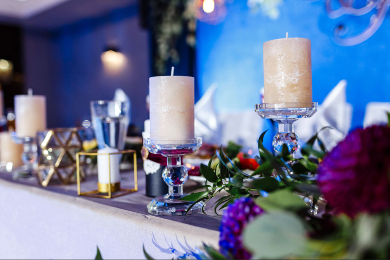
Choosing wedding colours is one of the first decisions that can shape the visual character of a celebration. The right palette brings the venue, flowers, stationery, bridal party and reception décor together without making every detail look identical. A carefully selected colour palette for wedding styling can also help couples create a setting that feels personal and photographs beautifully throughout the day.
The best approach is to begin with the wedding venue, season and overall atmosphere before choosing individual shades. A refined wedding colour palette usually combines a main colour with supporting tones and one or two subtle accent shades.
Colours can influence how a wedding feels. Soft ivory, blush and champagne can create a romantic atmosphere, while deep green, navy and burgundy can give a more dramatic impression. Light blue and sage often feel calm and natural, whereas warm terracotta and peach can create a relaxed setting. When choosing a wedding colour, the couple can consider the mood they want guests to experience. The colour should also work with the venue rather than compete with its architecture, furniture or existing wedding decoration.
A wedding palette can reflect the couple’s preferred style. Classic celebrations may suit ivory, white, champagne and muted green. Modern weddings can use black, white, taupe or metallic accents, while romantic celebrations often feature dusty rose, mauve or soft peach. A destination wedding may benefit from colours inspired by the surrounding landscape. The most successful palettes usually feel connected to the couple rather than following a trend simply because it is popular.
One flower, fabric, photograph, venue detail or even a landscape can become the starting point for the entire palette. Once the main shade has been selected, complementary and neutral tones can be added around it.
A simple three-part structure works well:
This approach makes choosing a colour scheme for a wedding much easier because every additional detail can be compared with the original inspiration.
Indoor venues often allow richer colours because artificial lighting and architectural details provide a controlled setting. Deep emerald, navy, plum or burgundy can work particularly well in elegant ballrooms and historic venues. Outdoor celebrations often benefit from colours that respond naturally to their surroundings. Sage, dusty blue, sand, ivory and muted peach can complement gardens, vineyards and coastal locations. The venue should always remain part of the palette decision. A strong colour combination can look completely different when placed against dark wood, white walls, greenery or stone architecture.
Natural light can change the appearance of fabrics, flowers and stationery. Soft morning light may make pale shades appear brighter, while direct afternoon sunlight can make some colours look stronger. Couples planning an outdoor ceremony should view fabric and stationery samples in daylight before making final decisions. This is particularly important for pale pink, beige, lavender and blue, where small changes in lighting can affect the perceived shade.
Each season offers natural inspiration for wedding colours. Spring works well with soft greens, blush, lilac and pale blue. Summer allows brighter tones, while autumn can introduce terracotta, rust, olive and burgundy. Winter celebrations often suit ivory, deep green, navy, silver and champagne. The season can also influence flowers and fabrics, making it easier to create a consistent design from the ceremony through to the reception.
A beach wedding colour palette can draw inspiration from sand, sea and natural sunlight. Ivory, pale blue, soft beige, sage and muted coral can create an elegant coastal setting without becoming overly themed. For a sophisticated destination celebration, the couple can combine one coastal shade with warm neutrals. Natural textures such as linen, rattan and light wood can then support the colours without introducing too many additional tones.
A beach wedding colour palette should also consider the surrounding landscape. Turquoise water, pale sand and strong sunlight may already provide several colours, so a restrained selection often creates the most polished result.

Consistency matters more than using the same shade everywhere. The palette should guide the major visual elements while allowing different textures and tones to add depth.
Flowers can introduce the strongest expression of the palette. Table linens, candles, menus and glassware can then repeat selected tones without making the tables appear overly matched. For example, an ivory table setting can provide a neutral foundation while floral arrangements introduce dusty blue, sage or blush. This allows the colour palette for wedding styling to remain visible without overwhelming the reception.
Wedding stationery often introduces the palette before guests arrive. Invitations, menus, place cards and welcome signs can share similar tones, while bridesmaid dresses can reinforce the main colour. The dresses do not need to match the stationery exactly. Using related shades creates a softer and more sophisticated connection between the bridal party and the wider wedding design.
Elegance usually comes from balance rather than using many colours. Limiting the palette to a few carefully selected shades helps the venue and decorative details feel intentional. A refined wedding colour palette can combine one dominant colour, one complementary shade and a neutral foundation. Metallic details such as champagne gold or silver can be introduced sparingly for additional depth. When choosing a wedding colour, couples should also consider the existing colours of the venue. Working with the architecture, natural design surroundings and available light creates a more cohesive result than trying to transform every element.
Ultimately, choosing a colour scheme for a wedding is about creating a visual connection between the ceremony and reception. A thoughtful palette allows flowers, stationery, bridesmaid dresses and décor to work together while preserving the character of the couple’s celebration.
Leave a Comment